
Self-negotiated University Project - Rebranding of the Dubai based Al Nassma camel chocolate company (current branding at http://www.al-nasma.com) into a premium point of origin brand to enter the UK high end chocolate market.
While the USP of this brand is the camel milk, I have decided to do away with the camel and palm as too stereotypical and decided to let the texture (carton = sustainable but in this context = Saudi desert sand) and the copy carry that message, while I shifted the visual emphasis onto Arabic geometric patterns.
I decided to keep the Arabic brand name visible but update the type face to give the Arabic glyphs a clean, minimalist tone to bring the brand out of stereotypes of the Middle-East. In contrast, I applied a calligraphic tone to the Western transliteration of the brand.

Self-negotiated university project: Rebranding and new packaging for Al Nassma Camel milk chocolate.
Al Nassma means "the breeze" and my theme was "fragment".
To solve this, I have made each chocolate bar into a fragment of a whole image that is a visual representation of a gentle breeze, as the Arabic geometric patterns are gently blown from left to right (the target market is the UK so I have assumed a left to right reading pattern).
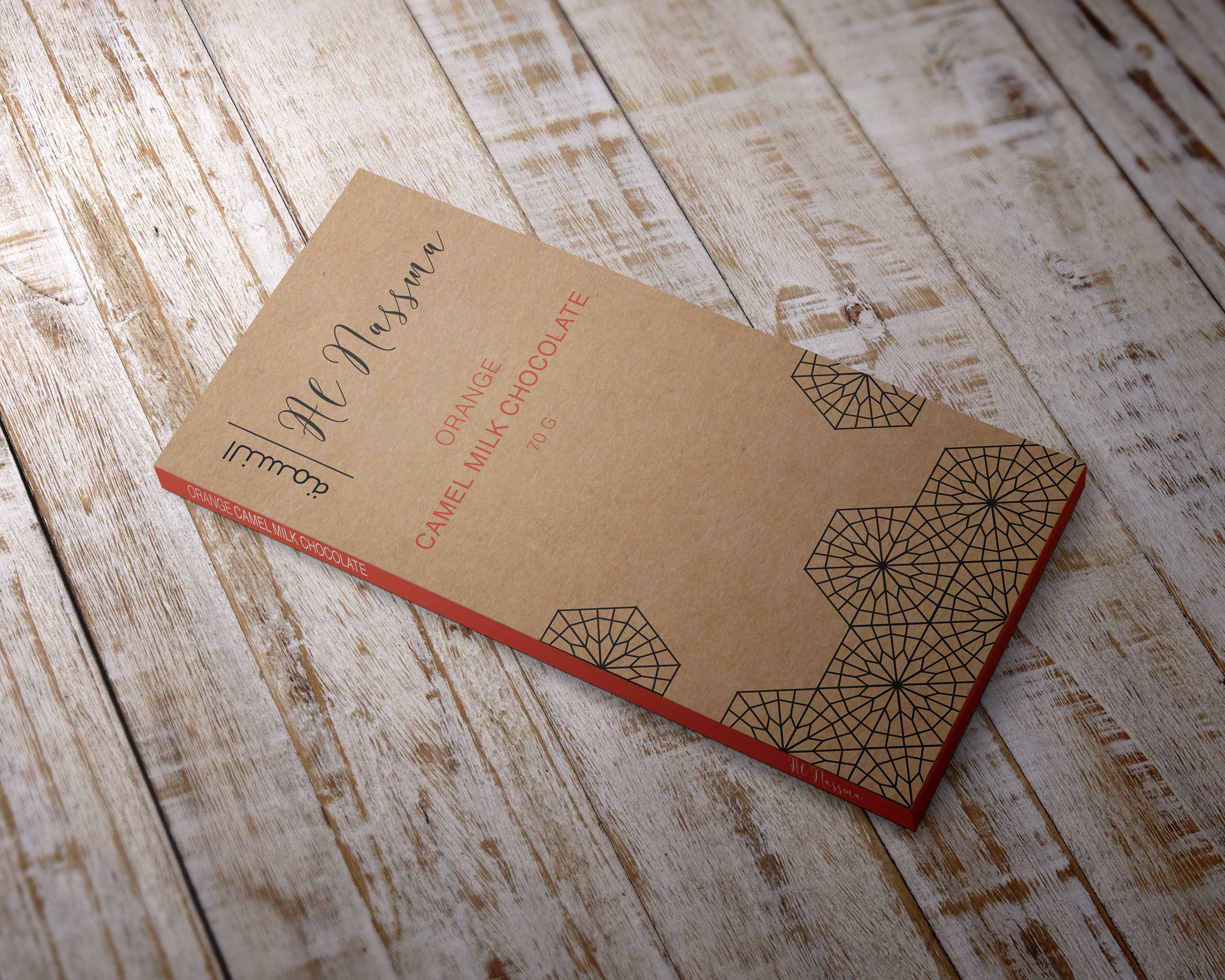
Mock-up example for the Orange flavoured chocolate bar, using accent colours to highlight the flavour.
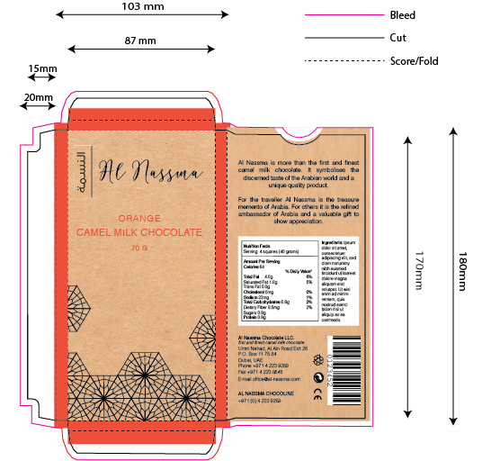
Packaging production net for the orange flavoured chocolate bar.